
Heatmap
<Heatmap
    data={orders}
    x=day
    y=category
    value=order_count
    valueFmt=usd
/>
Data Structure
Heatmap requires your data to contain 2 categorical columns (1 for the x-axis and 1 for the y-axis) and 1 numeric column.
Example
| Region | Product | Sales |
|---|---|---|
| West | A | 120 |
| East | C | 450 |
| East | B | 315 |
| East | A | 110 |
| West | C | 150 |
| West | B | 200 |
Unpivoting your Data
If you have data spread across columns, you can use the UNPIVOT feature in your SQL query to prepare the data for the heatmap.
Example
If you have a query result called region_sales:
| region | A | B | C |
|---|---|---|---|
| West | 120 | 200 | 150 |
| East | 110 | 315 | 450 |
You can use UNPIVOT like so:
UNPIVOT ${region_sales}
on COLUMNS(* EXCLUDE(region))
INTO
    NAME product
    VALUE sales
Which will return this table, which can be passed into the Heatmap:
| region | product | sales |
|---|---|---|
| West | A | 120 |
| West | B | 200 |
| West | C | 150 |
| East | A | 110 |
| East | B | 315 |
| East | C | 450 |
Note on Date Columns
Heatmap currently only works with string columns. If you would like to use a date column, cast it to a string in your SQL query before passing it into the Heatmap
Examples
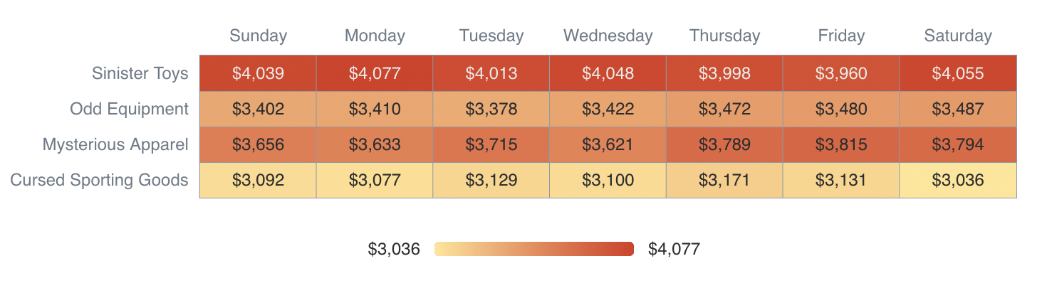
Basic Heatmap
<Heatmap
    data={orders}
    x=day
    y=category
    value=order_count
    valueFmt=usd
/>
Custom Color Palette

<Heatmap
    data={orders}
    x=day
    y=category
    value=order_count
    colorPalette={['white', 'green']}
    title="Weekday Orders"
    subtitle="By Category"
/>
Rotated Labels
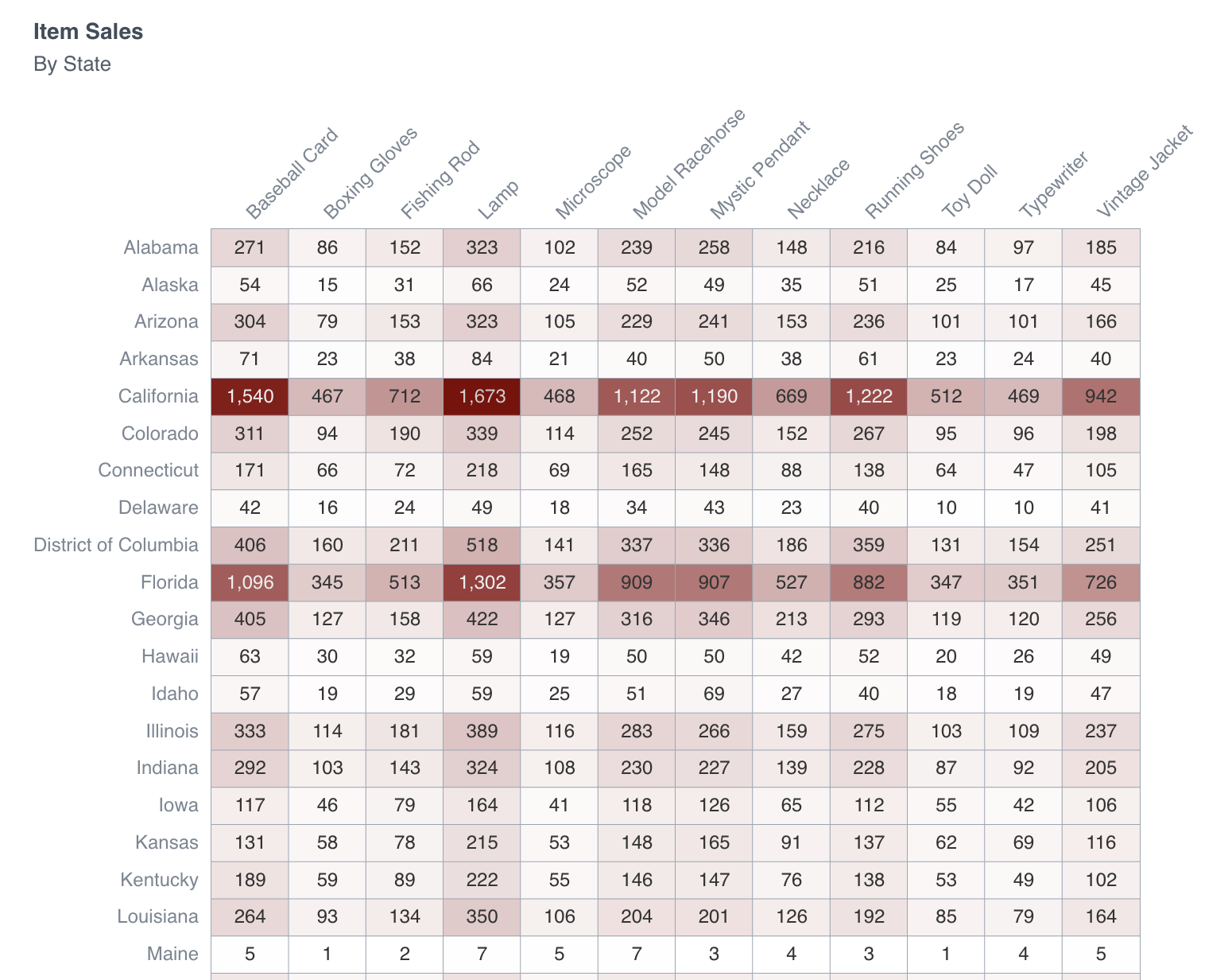
<Heatmap
    data={item_state}
    x=item
    y=state
    value=orders
    xLabelRotation=-45
    colorPalette={['white', 'maroon']}
    title="Item Sales"
    subtitle="By State"
    rightPadding=40
    cellHeight=25
/>
Options
Data
Query name, wrapped in curly braces
- Options:
- query name
Categorical column to use for the x-axis. If you want to use dates, cast them to strings in your query first
- Options:
- column name
Categorical column to use for the y-axis. If you want to use dates, cast them to strings in your query first
- Options:
- column name
Numeric column to use for the y-axis
- Options:
- column name
Minimum number for the heatmap's color scale
- Options:
- number
- Default:
- min of value column
Maximum number for the heatmap's color scale
- Options:
- number
- Default:
- max of value column
Sets behaviour for empty datasets. Can throw an error, a warning, or allow empty. When set to 'error', empty datasets will block builds in build:strict. Note this only applies to initial page load - empty datasets caused by input component changes (dropdowns, etc.) are allowed.
- Default:
- error
Text to display when an empty dataset is received - only applies when emptySet is 'warn' or 'pass', or when the empty dataset is a result of an input component change (dropdowns, etc.).
- Options:
- string
- Default:
- No records
String to display in place of zeros
- Options:
- string
Array of colors to form the gradient for the heatmap.
- Options:
- array of color codes - e.g., {['navy', 'white', '#c9c9c9']}
Format to use for value column (see available formats)
- Options:
- Excel-style format | built-in format name | custom format name
Number representing the height of cells in the heatmap
- Options:
- number
- Default:
- 30
Number representing the padding (whitespace) on the left side of the chart. Useful to avoid labels getting cut off
- Options:
- number
- Default:
- 0
Number representing the padding (whitespace) on the left side of the chart. Useful to avoid labels getting cut off
- Options:
- number
- Default:
- 2
Degrees to rotate the labels on the x-axis. Can be negative number to reverse direction. 45 and -45 are common options
- Options:
- number
- Default:
- 0
Column to sort x values by
- Options:
- column name
Column to sort y values by
- Options:
- column name
Chart title. Appears at top left of chart.
- Options:
- string
Chart subtitle. Appears just under title.
- Options:
- string
Minimum height of the chart area (excl. header and footer) in pixels. Adjusting the height affects all viewport sizes and may impact the mobile UX.
- Options:
- number
- Default:
- auto set based on y-axis values
Which chart renderer type (canvas or SVG) to use. See ECharts' documentation on renderers.
- Default:
- canvas
Custom Echarts options to override the default options. See reference page for available options.
- Options:
- {{exampleOption:'exampleValue'}}
Custom Echarts options to override the default options for all series in the chart. This loops through the series to apply the settings rather than having to specify every series manually using echartsOptions See reference page for available options.
- Options:
- {{exampleSeriesOption:'exampleValue'}}
Group name to connect this chart to other charts for synchronized tooltip hovering. Charts with the same connectGroup name will become connected