
Box Plot
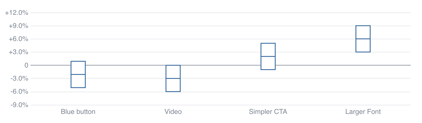
<BoxPlot
    data={box}
    name=experiment
    midpoint=value
    confidenceInterval=confidence
    yFmt='+0.0%;-0.0%;0'
/>
Data Structure
The BoxPlot component requires pre-aggregated data, with one row per box you would like to display. There are 2 ways to pass in the values needed to construct the box:
1. Explicitly define each value (e.g., min, intervalBottom, midpoint, intervalTop, max)
| name | intervalBottom | midpoint | intervalTop |
|---|---|---|---|
| Experiment A | 0.02 | 0.04 | 0.08 |
| Experiment B | -0.01 | 0.01 | 0.02 |
This example table excludes whiskers which would be defined with min and max columns
2. Define a midpoint and a confidenceInterval - this will add the interval to the midpoint to get the max, and subtract to get the min
| name | midpoint | confidenceInterval |
|---|---|---|
| Experiment A | 0.04 | 0.03 |
| Experiment B | 0.01 | 0.04 |
Examples
Basic Box Plot
<BoxPlot
    data={box}
    name=experiment
    midpoint=value
    confidenceInterval=confidence
    yFmt='+0.0%;-0.0%;0'
/>
Horizontal Box Plot
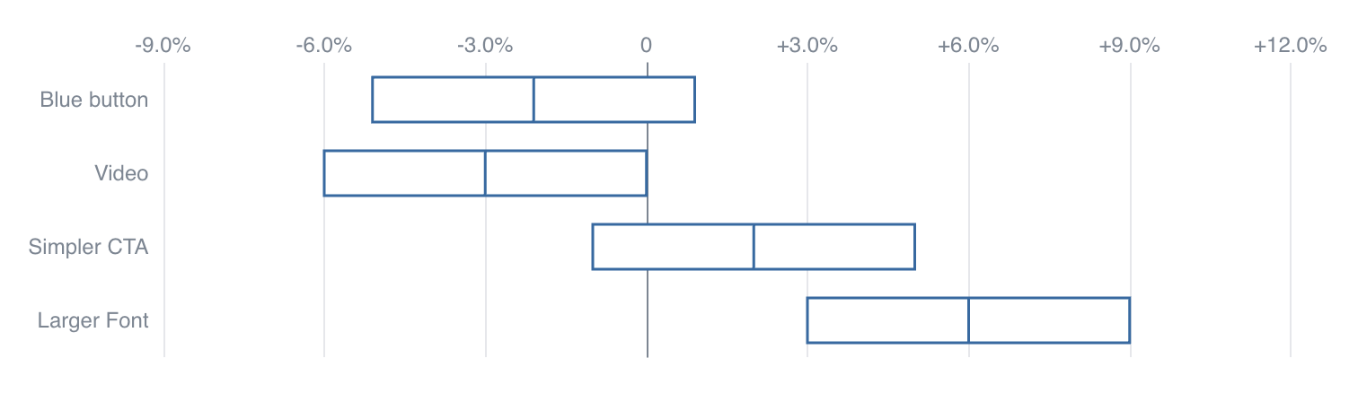
<BoxPlot
    data={box}
    name=experiment
    midpoint=value
    confidenceInterval=confidence
    swapXY=true
    yFmt='+0.0%;-0.0%;0'
/>
Box Plot with Whiskers

<BoxPlot
    data={box}
    name=experiment
    midpoint=value
    min=min
    max=max
    confidenceInterval=confidence
    yFmt='+0.0%;-0.0%;0'
/>
Box Plot with Custom Colors

<BoxPlot
    data={box}
    name=experiment
    midpoint=value
    min=min
    max=max
    color=color
    confidenceInterval=confidence
    swapXY=true
    yFmt='+0.0%;-0.0%;0'
/>
Options
Data
Query name, wrapped in curly braces
- Options:
- query name
Column to use for the names of each box in your plot
- Options:
- column name
Column containing minimum values, appearing as whisker
- Options:
- column name
Column containing values for bottom of box
- Options:
- column name
Column containing values for midpoint of box
- Options:
- column name
Column containing values for top of box
- Options:
- column name
Column containing maximum values, appearing as whisker
- Options:
- column name
Column containing value to use in place of intervalBottom and intervalTop. Is subtracted from midpoint to get the bottom and added to midpoint to get the top
- Options:
- column name
Sets behaviour for empty datasets. Can throw an error, a warning, or allow empty. When set to 'error', empty datasets will block builds in build:strict. Note this only applies to initial page load - empty datasets caused by input component changes (dropdowns, etc.) are allowed.
- Default:
- error
Text to display when an empty dataset is received - only applies when emptySet is 'warn' or 'pass', or when the empty dataset is a result of an input component change (dropdowns, etc.).
- Options:
- string
- Default:
- No records
Formatting & Styling
Column containing color strings
- Options:
- column name
Format to use for y column (see available formats)
- Options:
- Excel-style format | built-in format name | custom format name
Apply a specific color to each series in your chart. Unspecified series will receive colors from the built-in palette as normal.
- Options:
- object with series names and assigned colors
- Default:
- colors applied by order of series in data
Axes
Starting value for the y-axis
- Options:
- number
Maximum value for the y-axis
- Options:
- number
Chart
Chart title. Appears at top left of chart.
- Options:
- string
Chart subtitle. Appears just under title.
- Options:
- string
Minimum height of the chart area (excl. header and footer) in pixels. Adjusting the height affects all viewport sizes and may impact the mobile UX.
- Options:
- number
- Default:
- 180
Which chart renderer type (canvas or SVG) to use. See ECharts' documentation on renderers.
- Default:
- canvas
Custom Echarts Options
Custom Echarts options to override the default options. See reference page for available options.
- Options:
- {{exampleOption:'exampleValue'}}
Custom Echarts options to override the default options for all series in the chart. This loops through the series to apply the settings rather than having to specify every series manually using echartsOptions. See reference page for available options.
- Options:
- {{exampleSeriesOption:'exampleValue'}}
Interactivity
Group name to connect this chart to other charts for synchronized tooltip hovering. Charts with the same connectGroup name will become connected
Annotations
Box plots can include annotations using the ReferenceLine and ReferenceArea components. These components are used within a chart component like so:
<BoxPlot
    data={box}
    name=experiment
    midpoint=value
    confidenceInterval=confidence
>
    <ReferenceLine y=0.04 label='Target'/>
</BoxPlot>