
Bar Chart

<BarChart
    data={query_name}
    x=column_x
    y=column_y
/>
Examples
Bar
<BarChart
    data={value_by_region}
    x=region
    y=value
    xAxisTitle=Region
/>
Horizontal Bar

<BarChart
    data={value_by_region}
    x=country
    y=value
    swapXY=true
/>
Stacked Bar

<BarChart
    data={annual_value_by_region}
    x=year
    y=value
    series=region
/>
Stacked Bar with Value Labels

<BarChart
    data={annual_value_by_region}
    x=year
    y=value
    series=region
    labels=true
    labelFmt=usd0k
/>
100% Stacked Bar

<BarChart
    data={annual_value_by_region}
    x=year
    y=value
    series=region
    type=stacked100
/>
Horizontal Stacked Bar

<BarChart
    data={annual_value_by_region}
    swapXY=true
    x=year
    y=value
    series=region
    xType=category
    sort=false
/>
Horizontal 100% Stacked Bar

<BarChart
    data={annual_value_by_region}
    swapXY=true
    x=year
    y=value
    series=region
    type=stacked100
    xType=category
    sort=false
/>
Grouped Bar

<BarChart
    data={annual_value_by_region}
    x=year
    y=value
    series=region
    type=grouped
/>
Horizontal Grouped Bar

<BarChart
    data={annual_value_by_region}
    swapXY=true
    x=year
    y=value
    series=region
    type=grouped
    xType=category
/>
Custom Color Palette

<BarChart
    data={orders_by_month}
    x=month
    y=sales
    series=category
    colorPalette={
        [
        '#cf0d06',
        '#eb5752',
        '#e88a87',
        '#fcdad9',
        ]
    }
/>
Long Bar Chart
If you create a bar chart with many x-axis items (e.g., names of departments), Evidence will extend the height of the chart for you to avoid the bars becoming squished. See Long Bar example below.

<BarChart
    data={complaints_by_category}
    x=category
    y=complaints
    swapXY=true
    yAxisTitle="Calls Received"
/>
Secondary y Axis

<BarChart
    data={orders_by_month}
    x=month
    y=sales_usd0k
    y2=num_orders_num0
/>
Secondary Axis with Line
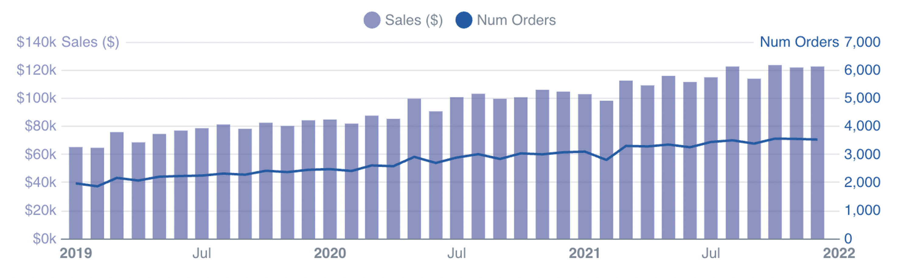
<BarChart
    data={orders_by_month}
    x=month
    y=sales_usd0k
    y2=num_orders_num0
    y2SeriesType=line
    colorPalette={['rgb(110,117,176,0.8)','rgb(37,91,161)']}
/>
Options
Data
Query name, wrapped in curly braces
- Options:
- query name
Column to use for the x-axis of the chart
- Options:
- column name
- Default:
- First column
Column(s) to use for the y-axis of the chart
- Options:
- column name | array of column names
- Default:
- Any non-assigned numeric columns
Column(s) to include on a secondary y-axis
- Options:
- column name | array of column names
Column to use as the series (groups) in a multi-series chart
- Options:
- column name
Name for an individual stack. If separate Bar components are used with different stackNames, the chart will show multiple stacks
- Options:
- string
Sets behaviour for empty datasets. Can throw an error, a warning, or allow empty. When set to 'error', empty datasets will block builds in build:strict. Note this only applies to initial page load - empty datasets caused by input component changes (dropdowns, etc.) are allowed.
- Default:
- error
Text to display when an empty dataset is received - only applies when emptySet is 'warn' or 'pass', or when the empty dataset is a result of an input component change (dropdowns, etc.).
- Options:
- string
- Default:
- No records
Formatting & Styling
Format to use for x column (see available formats)
- Options:
- Excel-style format | built-in format name | custom format name
Format to use for y column (see available formats)
- Options:
- Excel-style format | built-in format name | custom format name
Format to use for y2 column(s) (see available formats)
- Options:
- Excel-style format | built-in format name | custom format name
Color to override default series color. Only accepts a single color.
- Options:
- CSS name | hexademical | RGB | HSL
% of the full color that should be rendered, with remainder being transparent
- Options:
- number (0 to 1)
- Default:
- 1
Width of line surrounding each bar
- Options:
- number
- Default:
- 0
Color to use for outline if outlineWidth > 0
- Options:
- CSS name | hexademical | RGB | HSL
Array of custom colours to use for the chart. E.g., {['#cf0d06','#eb5752','#e88a87']}
- Options:
- array of color strings (CSS name | hexademical | RGB | HSL)
- Default:
- built-in color palette
Apply a specific color to each series in your chart. Unspecified series will receive colors from the built-in palette as normal. Note the double curly braces required in the syntax
- Options:
- object with series names and assigned colors
- Default:
- colors applied by order of series in data
Value Labels
Font size of value labels
- Options:
- number
- Default:
- 11
Font color of value labels
- Options:
- CSS name | hexademical | RGB | HSL
- Default:
- Automatic based on color contrast of background
Format to use for value labels (see available formats)
- Options:
- Excel-style format | built-in format name | custom format name
- Default:
- same as y column
Format to use for value labels for series on the y axis. Overrides any other formats (see available formats)
- Options:
- Excel-style format | built-in format name | custom format name
Format to use for value labels for series on the y2 axis. Overrides any other formats (see available formats)
- Options:
- Excel-style format | built-in format name | custom format name
Axes
Base to use when log scale is enabled
- Options:
- number
- Default:
- 10
Starting value for the y-axis
- Options:
- number
Maximum value for the y-axis
- Options:
- number
Starting value for the y2-axis
- Options:
- number
Maximum value for the y2-axis
- Options:
- number
Chart
Chart title. Appears at top left of chart.
- Options:
- string
Chart subtitle. Appears just under title.
- Options:
- string
Minimum height of the chart area (excl. header and footer) in pixels. Adjusting the height affects all viewport sizes and may impact the mobile UX.
- Options:
- number
- Default:
- 180
Which chart renderer type (canvas or SVG) to use. See ECharts' documentation on renderers.
- Default:
- canvas
Custom Echarts Options
Custom Echarts options to override the default options. See reference page for available options.
- Options:
- {{exampleOption:'exampleValue'}}
Custom Echarts options to override the default options for all series in the chart. This loops through the series to apply the settings rather than having to specify every series manually using echartsOptions. See reference page for available options.
- Options:
- {{exampleSeriesOption:'exampleValue'}}
Interactivity
Group name to connect this chart to other charts for synchronized tooltip hovering. Charts with the same connectGroup name will become connected
Annotations
Bar charts can include annotations using the ReferenceLine and ReferenceArea components. These components are used within a chart component like so:
<BarChart data={sales_data} x=date y=sales>
  <ReferenceLine data={target_data} y=target label=name/>
  <ReferenceArea xMin='2020-03-14' xMax='2020-05-01'/>
</BarChart>