
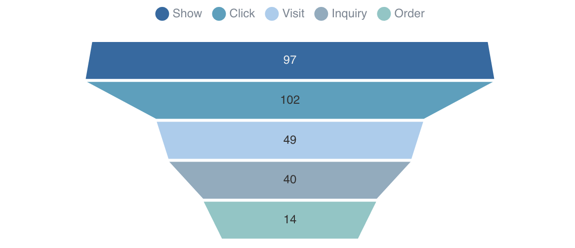
Funnel Chart
<FunnelChart
    data={query_name}
    nameCol=column_name
    valueCol=column_value
/>
Examples
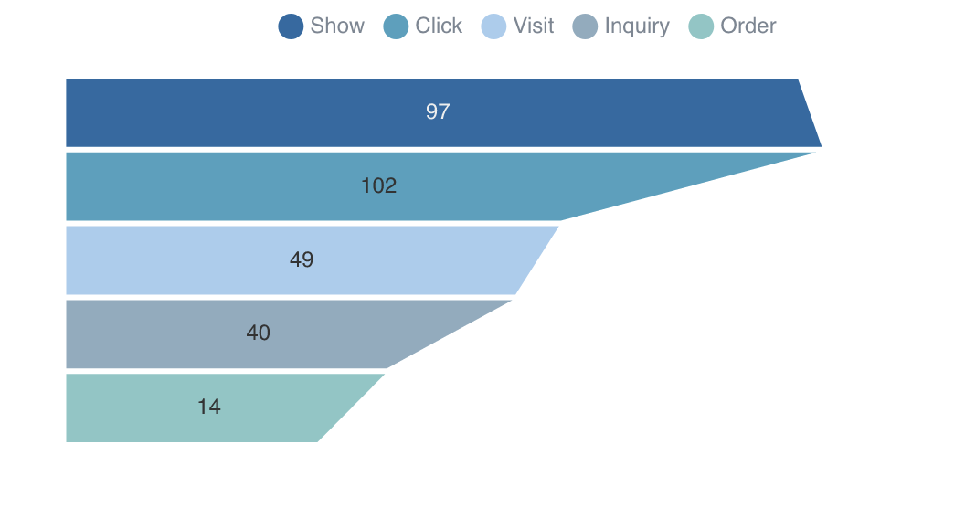
Ascending

<FunnelChart
    data={query_name}
    nameCol=column_name
    valueCol=column_value
    funnelSort=ascending
/>
Alignment
<FunnelChart
    data={query_name}
    nameCol=column_name
    valueCol=column_value
    funnelAlign=left
/>
Show Percent Label

<FunnelChart
    data={query_name}
    nameCol=column_name
    valueCol=column_value
    showPercent=true
/>
Options
Data
Query name, wrapped in curly braces
- Options:
- query name
Column to use for the name of the chart
- Options:
- column name
Column to use for the value of the chart
- Options:
- column name
Sets behaviour for empty datasets. Can throw an error, a warning, or allow empty. When set to 'error', empty datasets will block builds in build:strict. Note this only applies to initial page load - empty datasets caused by input component changes (dropdowns, etc.) are allowed.
- Default:
- error
Text to display when an empty dataset is received - only applies when emptySet is 'warn' or 'pass', or when the empty dataset is a result of an input component change (dropdowns, etc.).
- Options:
- string
- Default:
- No records
Formatting & Styling
Format to use for valueCol (see available formats)
- Options:
- Excel-style format | built-in format | custom format
Border color. Only accepts a single color.
- Options:
- CSS name | hexademical | RGB | HSL
- Default:
- transparent
Border Width. It should be a natural number.
- Options:
- number
- Default:
- 1
Array of custom colours to use for the chart. E.g., {['#cf0d06','#eb5752','#e88a87']}
- Options:
- array of color strings (CSS name | hexademical | RGB | HSL)
- Default:
- built-in color palette
Chart
Chart title. Appears at top left of chart.
- Options:
- string
Chart subtitle. Appears just under title.
- Options:
- string
Which chart renderer type (canvas or SVG) to use. See ECharts' documentation on renderers.
- Default:
- canvas
Custom Echarts Options
Custom Echarts options to override the default options. See reference page for available options.
- Options:
- {{exampleOption:'exampleValue'}}
Custom Echarts options to override the default options for all series in the chart. This loops through the series to apply the settings rather than having to specify every series manually using echartsOptions See reference page for available options.
- Options:
- {{exampleSeriesOption:'exampleValue'}}
Interactivity
Group name to connect this chart to other charts for synchronized tooltip hovering. Charts with the same connectGroup name will become connected