
Calendar Heatmap

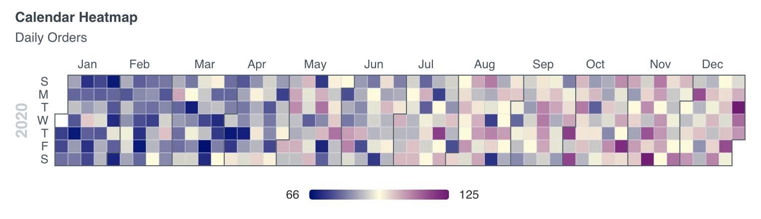
<CalendarHeatmap
    data={oneyear}
    date=date
    value=orders
    title="Calendar Heatmap"
    subtitle="Daily Orders"
    yearLabel=false
/>
Examples
Multi-year Calendar Heatmap
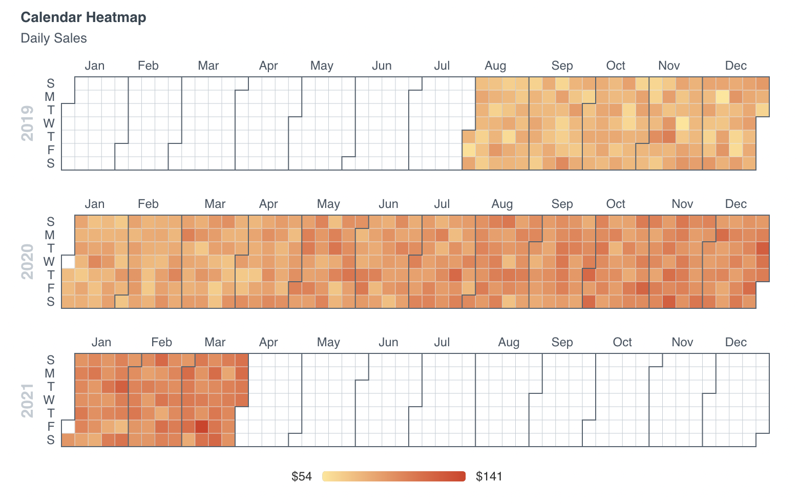
<CalendarHeatmap
    data={orders_by_day}
    date=date
    value=orders
    title="Calendar Heatmap"
    subtitle="Daily Sales"
/>
Custom Color Palette
<CalendarHeatmap
    data={oneyear}
    date=date
    value=orders
    title="Calendar Heatmap"
    subtitle="Daily Orders"
    colorPalette={['navy', 'lightyellow', 'purple']}
/>
Without Year Label
<CalendarHeatmap
    data={oneyear}
    date=date
    value=orders
    title="Calendar Heatmap"
    subtitle="Daily Orders"
    yearLabel=false
/>
Options
Data
Query name, wrapped in curly braces
- Options:
- query name
Date column to use for the calendar
- Options:
- column name
Numeric column to use for the y-axis
- Options:
- column name
Minimum number for the calendar heatmap's color scale
- Options:
- number
- Default:
- min of value column
Maximum number for the calendar heatmap's color scale
- Options:
- number
- Default:
- max of value column
Sets behaviour for empty datasets. Can throw an error, a warning, or allow empty. When set to 'error', empty datasets will block builds in build:strict. Note this only applies to initial page load - empty datasets caused by input component changes (dropdowns, etc.) are allowed.
- Default:
- error
Text to display when an empty dataset is received - only applies when emptySet is 'warn' or 'pass', or when the empty dataset is a result of an input component change (dropdowns, etc.).
- Options:
- string
- Default:
- No records
Formatting & Styling
Array of colors to form the gradient for the heatmap. Remember to wrap your array in curly braces.
- Options:
- array of color codes - e.g., colorPalette={['navy', 'white', '#c9c9c9']}
Format to use for value column (see available formats)
- Options:
- Excel-style format | built-in format name | custom format name
Chart
Chart title. Appears at top left of chart.
- Options:
- string
Chart subtitle. Appears just under title.
- Options:
- string
Minimum height of the chart area (excl. header and footer) in pixels. Adjusting the height affects all viewport sizes and may impact the mobile UX.
- Options:
- number
- Default:
- auto set based on y-axis values
Which chart renderer type (canvas or SVG) to use. See ECharts' documentation on renderers.
- Default:
- canvas
Custom Echarts Options
Custom Echarts options to override the default options. See reference page for available options.
- Options:
- {{exampleOption:'exampleValue'}}
Custom Echarts options to override the default options for all series in the chart. This loops through the series to apply the settings rather than having to specify every series manually using echartsOptions. See reference page for available options.
- Options:
- {{exampleSeriesOption:'exampleValue'}}
Interactivity
Group name to connect this chart to other charts for synchronized tooltip hovering. Charts with the same connectGroup name will become connected