

Annotations
Use annotations to add important context directly to a chart - highlight areas, or specific points to make it easier for your reader to draw insights.
At a glance
Evidence currently offers 4 types of annotations, which can be defined inline or with a dataset:
ReferenceLine: draw a line on a chart (e.g. sales target, launch dates, linear regression)ReferenceArea: highlight an area on a chart (e.g. holiday shopping periods, metric control ranges)ReferencePoint: highlight specific points on a chart (e.g. anomalies, points of interest)Callout: draw attention to data (e.g. data trend explanation)
<LineChart data={orders_by_month} x=month y=sales yFmt=usd0>
    <ReferenceLine y=7500 label="Reference Line" hideValue labelPosition="aboveStart" color=positive/>
    <ReferenceArea xMin='2020-03-14' xMax='2020-08-15' label="Reference Area" color=warning/>
    <ReferencePoint x="2019-07-01" y=6590 label="Reference Point" labelPosition=bottom color=negative/>
    <Callout x="2021-05-01" y=11012 labelPosition=bottom labelWidth=fit>
        Callout
        Data trending up here
    </Callout>
</LineChart>
Reference Line
Reference lines allow you to add lines to a chart to provide additional context within the visualization. These lines can be produced by providing a specific value (y=50 or x='2020-03-14') or by providing a dataset (e.g., date, event_name).
If you provide coordinates for [x, y] and [x2, y2], you can create sloped lines between points.
When a dataset is provided, ReferenceLine can generate multiple lines - one for each row in the dataset. This can be helpful for plotting things like important milestones, launch dates, or experiment start dates.
Examples
Y-axis Defined Inline
<LineChart data={orders_by_month} x=month y=sales yAxisTitle="Sales per Month" yFmt=usd0>
    <ReferenceLine y=9000 label="Target"/>
</LineChart>
X-axis Defined Inline
<LineChart data={orders_by_month} x=month y=sales yAxisTitle="Sales per Month" yFmt=usd0>
    <ReferenceLine x='2019-09-18' label="Launch" hideValue=true/>
</LineChart>
Y-axis Multiple Lines
<LineChart data={orders_by_month} x=month y=sales yFmt=usd0 yAxisTitle="Sales per Month">
    <ReferenceLine y=9000 label="Target" labelPosition=belowEnd/>
    <ReferenceLine y=10500 label="Forecast"/>
</LineChart>
X-axis from Data
<LineChart data={orders_by_month} x=month y=sales yFmt=usd0 yAxisTitle="Sales per Month">
    <ReferenceLine data={multiple_dates} x=start_date label=campaign_name hideValue/>
</LineChart>
Sloped Line Inline
<LineChart data={orders_by_month} x=month y=sales yFmt=usd0 yAxisTitle="Sales per Month">
    <ReferenceLine x='2019-01-01' y=6500 x2='2021-12-01' y2=12000 label="Growth Trend" labelPosition=belowEnd/>
</LineChart>
Linear Regression from Data
Custom Styling
<LineChart data={orders_by_month} x=month y=sales_usd0k yAxisTitle="Sales per Month">
    <ReferenceLine y=110000 color=negative hideValue=true lineWidth=3 lineType=solid/>
</LineChart>
Label Positions
<LineChart data={orders_by_month} x=month y=sales yFmt=usd0k yAxisTitle="Sales per Month">
    <ReferenceLine y=4000 label=aboveStart labelPosition=aboveStart hideValue/>
    <ReferenceLine y=4000 label=aboveCenter labelPosition=aboveCenter hideValue/>
    <ReferenceLine y=4000 label=aboveEnd labelPosition=aboveEnd hideValue/>
    <ReferenceLine y=4000 label=belowStart labelPosition=belowStart hideValue/>
    <ReferenceLine y=4000 label=belowCenter labelPosition=belowCenter hideValue/>
    <ReferenceLine y=4000 label=belowEnd labelPosition=belowEnd hideValue/>
</LineChart>
Colours
<LineChart data={orders_by_month} x=month y=sales yFmt=usd0k yAxisTitle="Sales per Month">
    <ReferenceLine y=1500 color=negative label=negative/>
    <ReferenceLine y=3500 color=warning label=warning/>
    <ReferenceLine y=5500 color=positive label=positive/>
    <ReferenceLine y=7500 color=info label=info/>
    <ReferenceLine y=9500 color=base-content-muted label=base-content-muted/>
    <ReferenceLine y=11500 color=#63178f label=custom/>
</LineChart>
Options
A reference line can be produced by defining values inline or by supplying a dataset, and the required props are different for each of those cases.
Defining Values Inline
- Options:
- number | string | date
- Options:
- number
- Options:
- number | string | date
- Options:
- number
- Options:
- string
This table shows how you combine x, y, x2, and y2 to create different types of lines:
If you provide [x, y] and [x2, y2], coordinates must fall within the chart's boundaries in order for the line to be drawn.
Supplying a Dataset
- Options:
- query name
- Options:
- column name
- Options:
- column name
- Options:
- column name
- Options:
- column name
- Options:
- column name
If you provide [x, y] and [x2, y2], coordinates must fall within the chart's boundaries in order for lines to be drawn.
Styling
- Options:
- CSS name | hexademical | RGB | HSL
- Options:
- CSS name | hexademical | RGB | HSL
- Options:
- number
- Default:
- 1.3
- Options:
- number
- Default:
- 8
- Options:
- number
- Default:
- 8
- Options:
- CSS name | hexademical | RGB | HSL
- Options:
- number
- Options:
- number
- Options:
- number
- Options:
- CSS name | hexademical | RGB | HSL
- Options:
- number
Reference Area
Reference areas allow you to add highlighted ranges to a chart. These ranges can be:
- Along the x-axis (e.g., recession date ranges)
- Along the y-axis (e.g., control threshold for a metric)
- Both (e.g, highlighting a specific series of points in the middle of the chart)
Reference areas can be produced by defining the x and y-axis values inline (e.g., xMin='2020-03-14' xMax='2020-06-30') or by supplying a dataset (e.g., start_date, end_date, name).
When a dataset is provided, ReferenceArea can generate multiple areas - one for each row in the dataset.
Examples
X-axis Defined Inline
<LineChart data={orders_by_month} x=month y=sales yFmt=usd0 yAxisTitle="Sales per Month">
    <ReferenceArea xMin='2020-03-14' xMax='2020-08-15' label=First color=warning/>
    <ReferenceArea xMin='2021-03-14' xMax='2021-08-15' label=Second/>
</LineChart>
Y-axis Defined Inline
<LineChart data={orders_by_month} x=month y=num_orders yAxisTitle="Orders per Month">
    <ReferenceArea yMin=250 color=positive label="Good"/>
    <ReferenceArea yMin=100 yMax=250 color=warning label="Okay"/>
    <ReferenceArea yMin=0 yMax=100 color=negative label="Bad"/>
</LineChart>
X-axis from Data
<LineChart data={orders_by_month} x=month y=sales yFmt=usd0 yAxisTitle="Sales per Month">
    <ReferenceArea data={multiple_dates} xMin=start_date xMax=end_date label=campaign_name/>
</LineChart>
Bar Chart
<BarChart data={orders_by_category_2021} x=month y=sales yFmt=usd0 series=category>
    <ReferenceArea xMin='2021-01-01' xMax='2021-04-01'/>
</BarChart>
Continuous Axis Bar Charts
On a continous x-axis (dates or numbers), the reference area will start and stop at the exact point on the x-axis. This means it will appear in the middle of whichever bar is at that point. If you would prefer to see the area cover the full bar, there are 2 ways to achieve this:
- Add a buffer on either side of the range you want to highlight (e.g., instead of ending the area at
2020-07-01, end it at2020-07-15) - Change your x-axis to categorical data (using
xType=category). If using a date axis, you may also want to retain the axis label formatting for dates - to achieve this, you can use thexFmtprop (e.g.,xFmt=mmm)
Reference Area Box
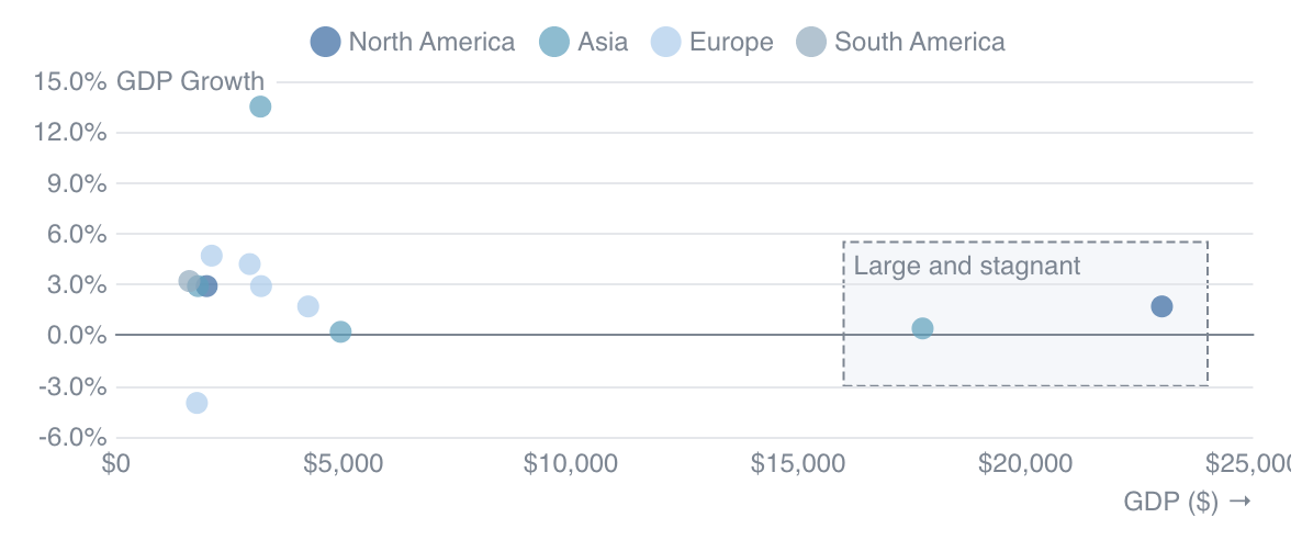
<ScatterPlot data={countries} x=gdp_usd y=gdp_growth_pct1 tooltipTitle=country series=continent>
    <ReferenceArea xMin=16000 xMax=24000 yMin=-0.03 yMax=0.055 label="Large and stagnant" color=base-content-muted border=true/>
</ScatterPlot>
Labels
<LineChart data={orders_by_month} x=month y=sales yFmt=usd0>
    <ReferenceArea xMin='2019-07-01' xMax='2021-07-31' label=topLeft labelPosition=topLeft areaColor="hsla(206.25, 80%, 80%, 0.01)"/>
    <ReferenceArea xMin='2019-07-01' xMax='2021-07-31' label=top labelPosition=top areaColor="hsla(206.25, 80%, 80%, 0.01)"/>
    <ReferenceArea xMin='2019-07-01' xMax='2021-07-31' label=topRight labelPosition=topRight areaColor="hsla(206.25, 80%, 80%, 0.01)"/>
    <ReferenceArea xMin='2019-07-01' xMax='2021-07-31' label=left labelPosition=left areaColor="hsla(206.25, 80%, 80%, 0.01)"/>
    <ReferenceArea xMin='2019-07-01' xMax='2021-07-31' label=center labelPosition=center areaColor="hsla(206.25, 80%, 80%, 0.01)"/>
    <ReferenceArea xMin='2019-07-01' xMax='2021-07-31' label=right labelPosition=right areaColor="hsla(206.25, 80%, 80%, 0.01)"/>
    <ReferenceArea xMin='2019-07-01' xMax='2021-07-31' label=bottomLeft labelPosition=bottomLeft areaColor="hsla(206.25, 80%, 80%, 0.01)"/>
    <ReferenceArea xMin='2019-07-01' xMax='2021-07-31' label=bottom labelPosition=bottom areaColor="hsla(206.25, 80%, 80%, 0.01)"/>
    <ReferenceArea xMin='2019-07-01' xMax='2021-07-31' label=bottomRight labelPosition=bottomRight areaColor="hsla(206.25, 80%, 80%, 0.01)"/>
</LineChart>
Label Overlaps
Reference areas appear behind chart gridlines, including reference area labels. If you are seeing an overlap between the gridlines and the reference area label, you can avoi this by turning gridlines off (yGridlines=false).
Colours
<LineChart data={orders_by_month} x=month y=sales yFmt=usd0 >
    <ReferenceArea xMax='2019-04-01' label=info color=info/>
    <ReferenceArea xMin='2019-04-01' xMax='2019-11-01' label=negative color=negative/>
    <ReferenceArea xMin='2019-11-01' xMax='2020-07-01' label=warning color=warning/>
    <ReferenceArea xMin='2020-07-01' xMax='2021-02-01' label=positive color=positive/>
    <ReferenceArea xMin='2021-02-01' xMax='2021-09-01' label=base-content-muted color=base-content-muted/>
    <ReferenceArea xMin='2021-09-01' label=custom color=#f2dbff labelColor=#4d1070/>
</LineChart>
Options
A reference area can be produced by defining values inline or by supplying a dataset, and the required props are different for each of those cases.
Defining Values Inline
- Options:
- number | string | date
- Options:
- number | string | date
- Options:
- number
- Options:
- number
- Options:
- string
- At least 1 of
xMin,xMax,yMin, oryMaxis required to plot an area.
Supplying a Dataset
- Options:
- query name
- Options:
- column name
- Options:
- column name
- Options:
- column name
- Options:
- column name
- Options:
- column name
- At least 1 of
xMin,xMax,yMin, oryMaxis required to plot an area.
Styling
- Options:
- CSS name | hexademical | RGB | HSL
- Options:
- CSS name | hexademical | RGB | HSL
- Options:
- number
- Default:
- false
- Options:
- CSS name | hexademical | RGB | HSL
- Options:
- number
- Options:
- CSS name | hexademical | RGB | HSL
- Options:
- CSS name | hexademical | RGB | HSL
- Options:
- CSS name | hexademical | RGB | HSL
- Options:
- number
- Options:
- number
- Options:
- number
- Options:
- CSS name | hexademical | RGB | HSL
- Options:
- number
Reference Point
Reference points allow you to add labels on certain points to emphasize them in the chart. They can be produced by providing a specific x/y coordinate (e.g. x="2021-05-01" y=11012) or by providing a dataset (e.g. anomalies, points).
When a dataset is provided, ReferencePoint will generate multiple points - one for each row in the dataset. This can be helpful for plotting a large number of points with a succinct syntax.
Examples
Defined Point
<LineChart data={orders_by_month} x=month y=sales yFmt=usd0>
    <ReferencePoint x="2019-07-01" y=6590 label="2019-07-01 : Big drop" labelPosition=bottom/>
</LineChart>
Points from Data
<LineChart data={orders_by_month} x=month y=sales yFmt=usd0>
    <ReferencePoint data={sales_drops} x=month y=sales label=label labelPosition=bottom align=right />
</LineChart>
Custom Styling
<LineChart data={orders_by_month} x=month y=sales yFmt=usd0>
    <ReferencePoint
        x="2019-07-01"
        y=6590
        label="2019-07-01 : Big drop"
        labelPosition=right
        color=negative
        symbolSize=16
        symbolBorderWidth=1
        symbolBorderColor=negative
        symbolOpacity=0.25
    />
</LineChart>
Label Positions
<LineChart data={orders_by_month} x=month y=sales yFmt=usd0>
    <ReferencePoint x="2019-07-01" y=6590 label=top labelPosition=top/>
    <ReferencePoint x="2019-07-01" y=6590 label=right labelPosition=right/>
    <ReferencePoint x="2019-07-01" y=6590 label=bottom labelPosition=bottom/>
    <ReferencePoint x="2019-07-01" y=6590 label=left labelPosition=left/>
</LineChart>
Multiline label
<LineChart data={orders_by_month} x=month y=sales yFmt=usd0>
    <ReferencePoint x="2019-07-01" y=6590 labelPosition=bottom align=left>
        A label with
        line breaks in it
        to allow longer text
    </ReferencePoint>
</LineChart>
Colours
<LineChart data={orders_by_month} x=month y=sales yFmt=usd0>
    <ReferencePoint x="2019-03-01" y=3000 color=info label=info />
    <ReferencePoint x="2019-09-01" y=3000 color=negative label=negative />
    <ReferencePoint x="2020-03-01" y=3000 color=warning label=warning />
    <ReferencePoint x="2020-09-01" y=3000 color=positive label=positive />
    <ReferencePoint x="2021-03-01" y=3000 color=base-content-muted label=base-content-muted />
    <ReferencePoint x="2021-09-01" y=3000 color=#63178f label=custom />
</LineChart>
Options
Defining Values Inline
- Options:
- number | string | date
- Options:
- number | string | date
- Options:
- string
Supplying a Dataset
- Options:
- query name
- Options:
- column name
- Options:
- column name
- Options:
- column name
Styling
- Options:
- CSS name | hexademical | RGB | HSL
- Default:
- base-content-muted
- Options:
- CSS name | hexademical | RGB | HSL
- Options:
- fit | string | number
- Default:
- fit
- Options:
- number
- Options:
- CSS name | hexademical | RGB | HSL
- Default:
- hsla(360, 100%, 100%, 0.7)
- Options:
- number
- Options:
- number
- Options:
- CSS name | hexademical | RGB | HSL
- Options:
- number
- Options:
- CSS name | hexademical | RGB | HSL
- Options:
- number
- Default:
- 8
- Options:
- number
- Options:
- number
- Options:
- CSS name | hexademical | RGB | HSL
Callout
Callouts are very similar to reference points, just with different default styling to optimize them for slightly different use cases. Callouts allow you to add a long label somewhere on a chart to describe a trend or provide insight on the data. They can be produced by providing a specific x/y coordinate (e.g. x="2021-05-01" y=11012) or by providing a dataset (e.g. anomalies, points).
When a dataset is provided, Callout will generate multiple points - one for each row in the dataset. This can be helpful for plotting a large number of points with a succinct syntax.
Examples
Defined Point
<LineChart data={orders_by_month} x=month y=sales yFmt=usd0>
    <Callout x="2019-07-01" y=6590 label="Sales really dropped here" labelPosition=bottom/>
</LineChart>
Points from Data
<LineChart data={orders_by_month} x=month y=sales yFmt=usd0>
    <Callout data={sales_drops} x=month y=sales label=label labelPosition=bottom align=right />
</LineChart>
Custom Styling
<LineChart data={orders_by_month} x=month y=sales yFmt=usd0>
    <Callout
        x="2019-07-01"
        y=6590
        label="Sales really dropped here"
        labelPosition=right
        color=negative
        symbolSize=16
        symbolBorderWidth=1
        symbolBorderColor=negative
        symbolOpacity=0.25
    />
</LineChart>
Label Positions
<LineChart data={orders_by_month} x=month y=sales yFmt=usd0>
    <Callout x="2019-07-01" y=6590 label=top labelPosition=top/>
    <Callout x="2019-07-01" y=6590 label=right labelPosition=right/>
    <Callout x="2019-07-01" y=6590 label=bottom labelPosition=bottom/>
    <Callout x="2019-07-01" y=6590 label=left labelPosition=left/>
</LineChart>
Multiline label
<LineChart data={orders_by_month} x=month y=sales yFmt=usd0>
    <Callout x="2019-07-01" y=6590 labelPosition=bottom align=left>
        Callout
        with
        line
        breaks
    </Callout>
</LineChart>
Colours
<LineChart data={orders_by_month} x=month y=sales yFmt=usd0>
    <Callout x="2019-03-01" y=3000 color=info label=info />
    <Callout x="2019-09-01" y=3000 color=negative label=negative />
    <Callout x="2020-03-01" y=3000 color=warning label=warning />
    <Callout x="2020-09-01" y=3000 color=positive label=positive />
    <Callout x="2021-03-01" y=3000 color=base-content-muted label=base-content-muted />
    <Callout x="2021-09-01" y=3000 color=#63178f label=custom />
</LineChart>
Options
Defining Values Inline
- Options:
- number | string | date
- Options:
- number | string | date
- Options:
- string
Supplying a Dataset
- Options:
- query name
- Options:
- column name
- Options:
- column name
- Options:
- column name
Styling
- Options:
- CSS name | hexademical | RGB | HSL
- Default:
- base-content-muted
- Options:
- CSS name | hexademical | RGB | HSL
- Options:
- fit | string | number
- Default:
- fit
- Options:
- number
- Options:
- CSS name | hexademical | RGB | HSL
- Default:
- hsla(360, 100%, 100%, 0.7)
- Options:
- number
- Options:
- number
- Options:
- CSS name | hexademical | RGB | HSL
- Options:
- number
- Options:
- CSS name | hexademical | RGB | HSL
- Options:
- number
- Default:
- 8
- Options:
- number
- Options:
- number
- Options:
- CSS name | hexademical | RGB | HSL